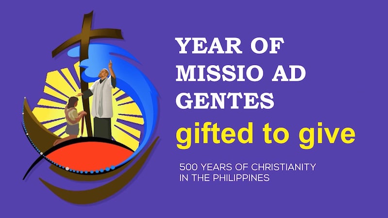
The Catholic Church has released the official theme and logo for the fifth centenary of Christianity in the Philippines.
LOGO ELEMENTS
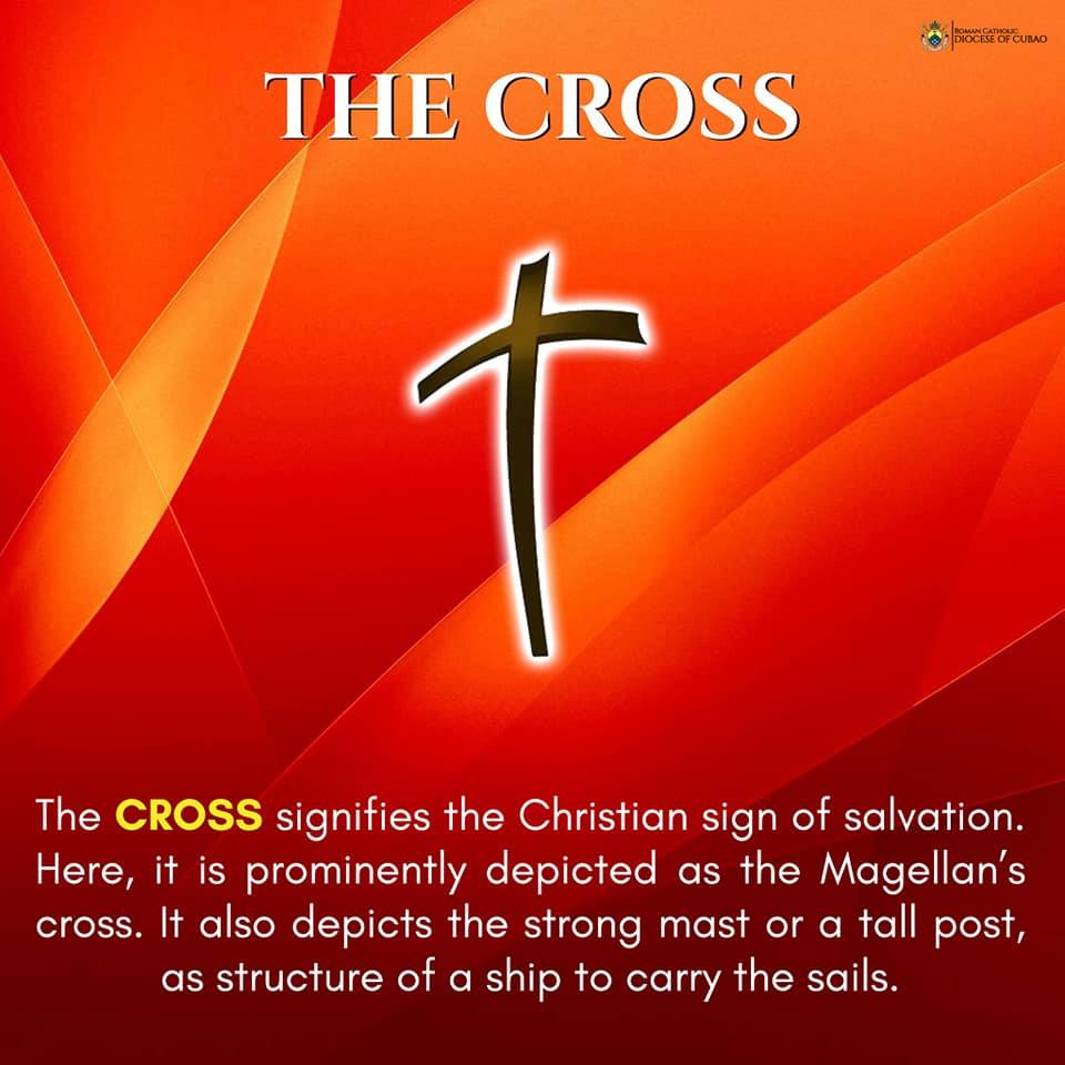
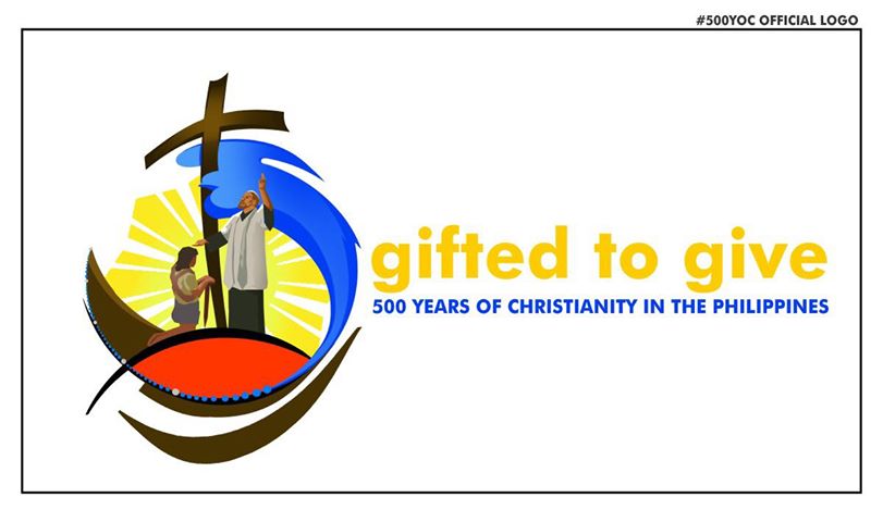
The CROSS signifies the Christian sign of salvation. Here, it is prominently depicted as the Magellan’s cross. It also depicts the strong mast or a tall post, as structure of a ship to carry the sails.
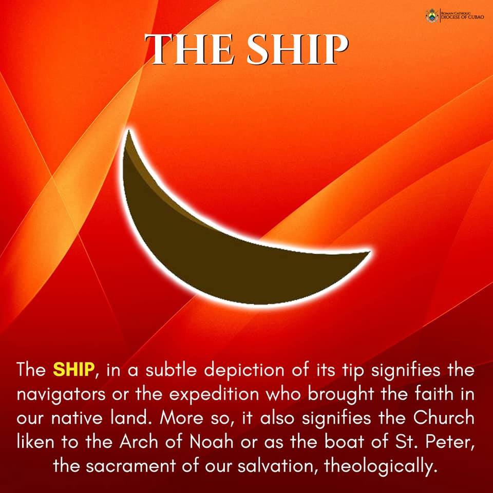
The SHIP, in a subtle depiction of its tip signifies the navigators or the expedition who brought the faith in our native land. More so, it also signifies the Church liken to the Arch of Noah or as the boat of St. Peter, the sacrament of our salvation, theologically.
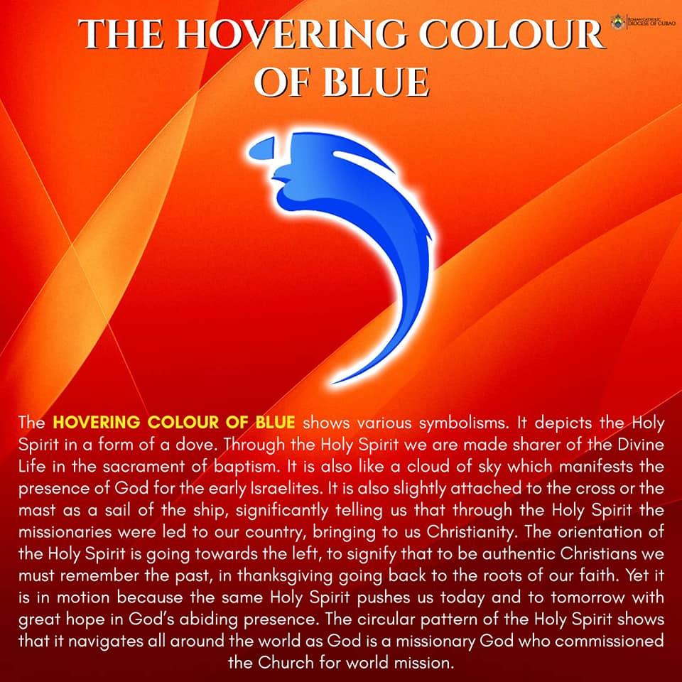
The HOVERING COLOUR OF BLUE shows various symbolisms. It depicts the Holy Spirit in a form of a dove. Through the Holy Spirit we are made sharer of the Divine Life in the sacrament of baptism. It is also like a cloud of sky which manifests the presence of God for the early Israelites. It is also slightly attached to the cross or the mast as a sail of the ship, significantly telling us that through the Holy Spirit the missionaries were led to our country, bringing to us Christianity. The orientation of the Holy Spirit is going towards the left, to signify that to be authentic Christians we must remember the past, in thanksgiving going back to the roots of our faith. Yet it is in motion because the same Holy Spirit pushes us today and to tomorrow with great hope in God’s abiding presence. The circular pattern of the Holy Spirit shows that it navigates all around the world as God is a missionary God who commissioned the Church for world mission.
The central figure is a graphic art, depicted from the painting of Fernando Amorsolo’s “First Baptism in the Philippines”, as it has been a suggestion to keep in mind this concept for, and so I chose to project it as it is, although minimally.

The background is the “PHILIPPINE SUN” a trademark of Fernando Amorsolo’s various artwork. Obviously it was derived from the Philippine flag, as it upholds the idea of our country being the pearl of the orient sea. More considerably, the sun signifies the new life, new beginning, the Risen Christ, the hope of our salvation.
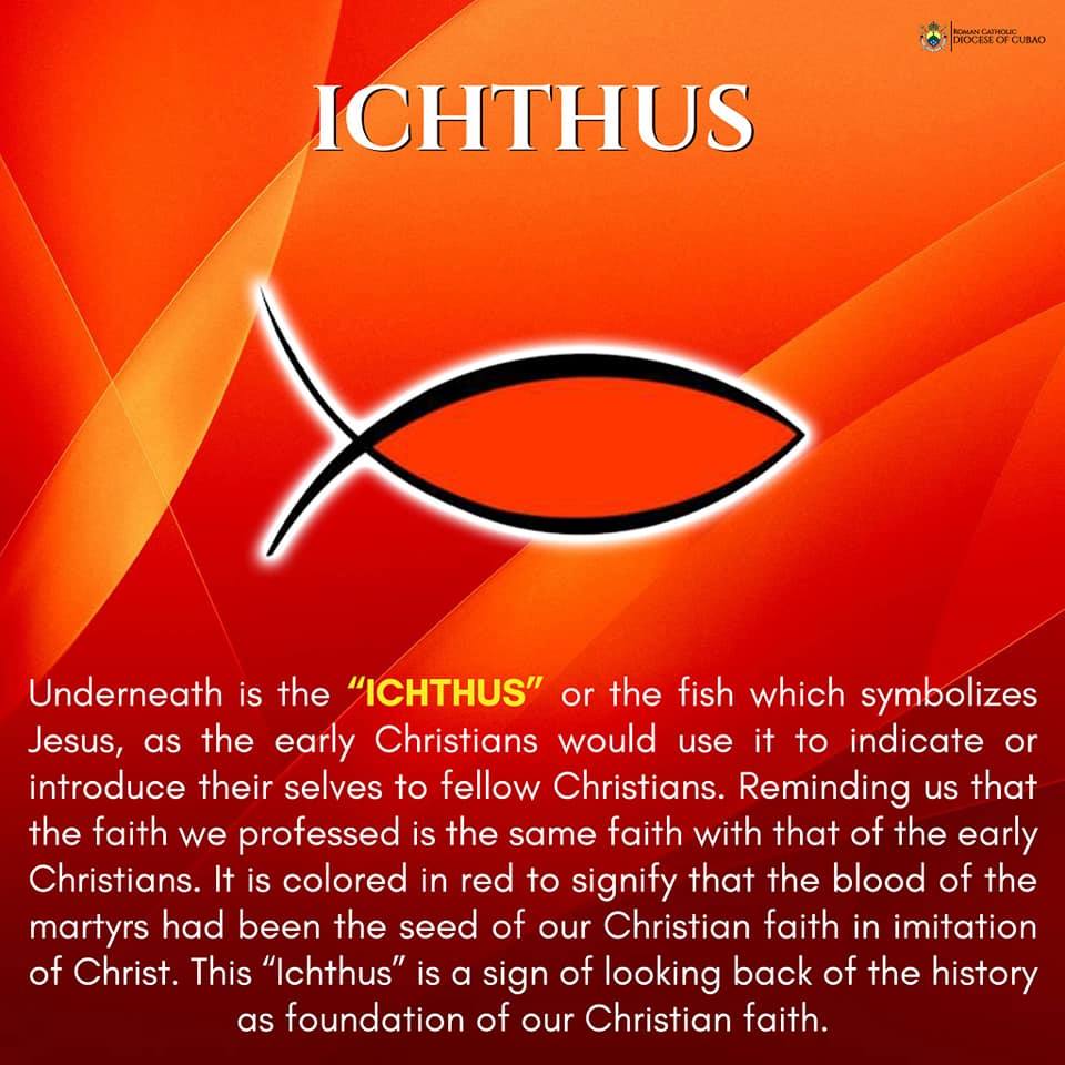
Underneath is the “ICHTHUS” or the fish which symbolizes Jesus, as the early Christians would use it to indicate or introduce their selves to fellow Christians. Reminding us that the faith we professed is the same faith with that of the early Christians. It is colored in red to signify that the blood of the martyrs had been the seed of our Christian faith in imitation of Christ. This “Ichthus” is a sign of looking back of the history as foundation of our Christian faith.
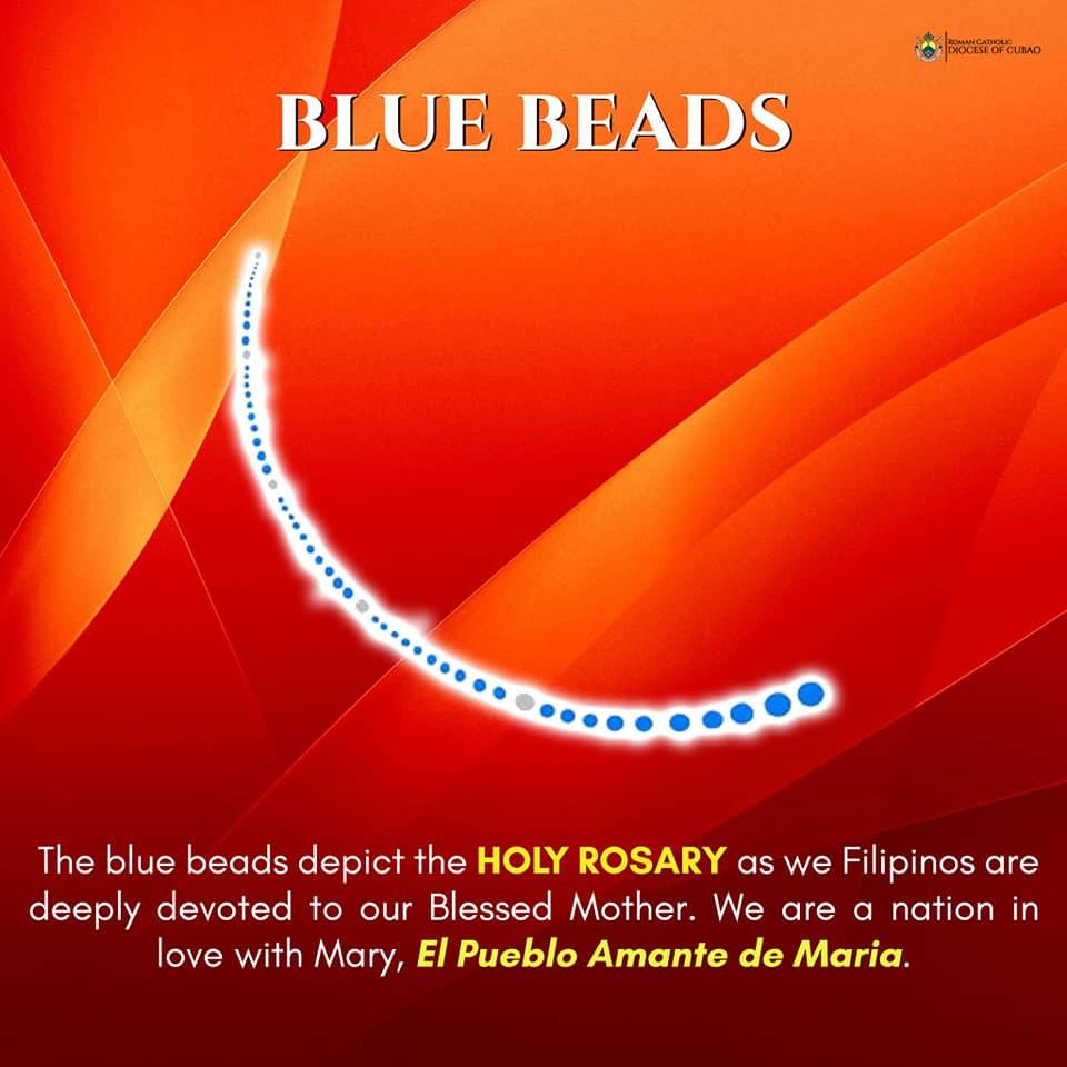
The blue beads depict the HOLY ROSARY as we Filipinos are deeply devoted to our Blessed Mother. We are a nation in love with Mary, El Pueblo Amante de Maria.
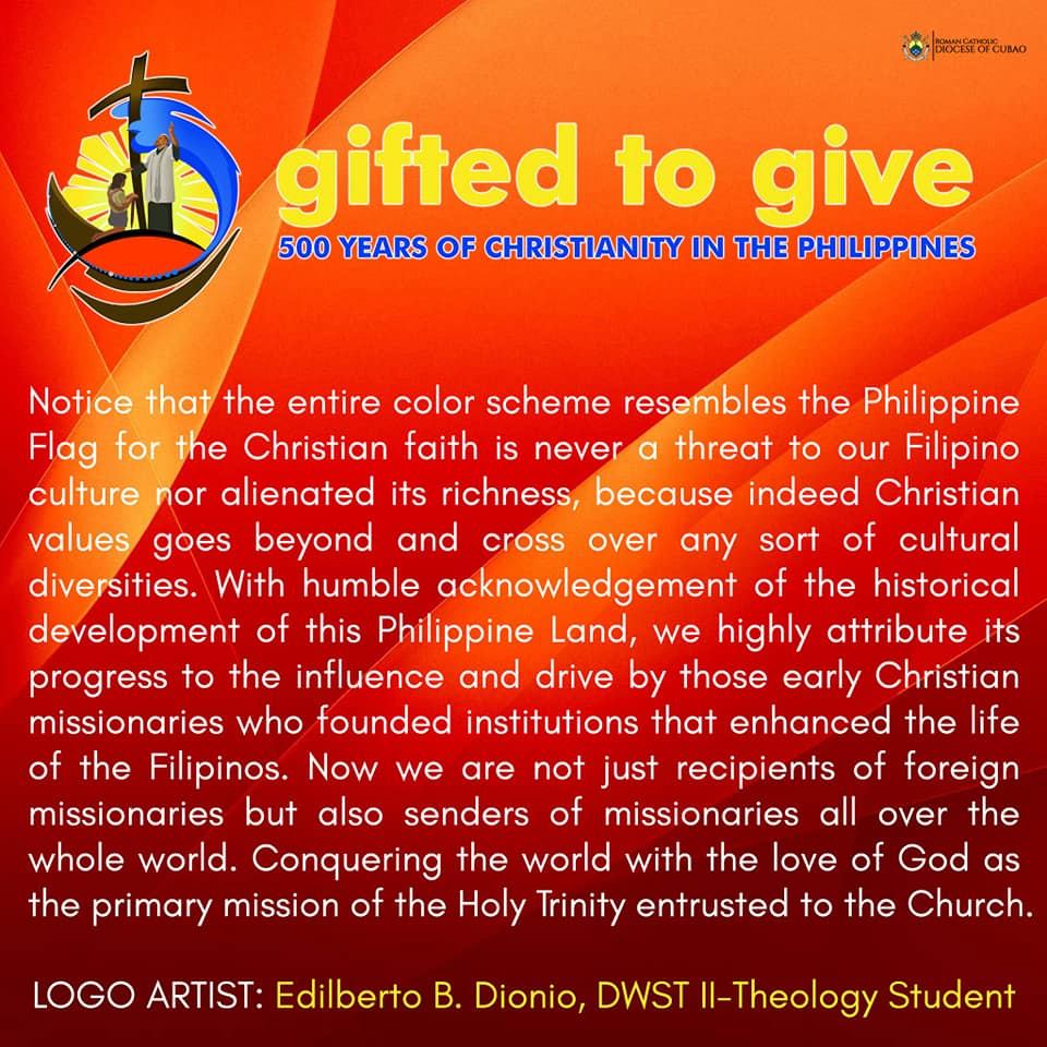
Notice that the entire color scheme resembles the Philippine Flag for the Christian faith is never a threat to our Filipino culture nor alienated its richness, because indeed Christian values goes beyond and cross over any sort of cultural diversities. With humble acknowledgement of the historical development of this Philippine Land, we highly attribute its progress to the influence and drive by those early Christian missionaries who founded institutions that enhanced the life of the Filipinos. Now we are not just recipients of foreign missionaries but also senders of missionaries all over the whole world. Conquering the world with the love of God as the primary mission of the Holy Trinity entrusted to the Church.
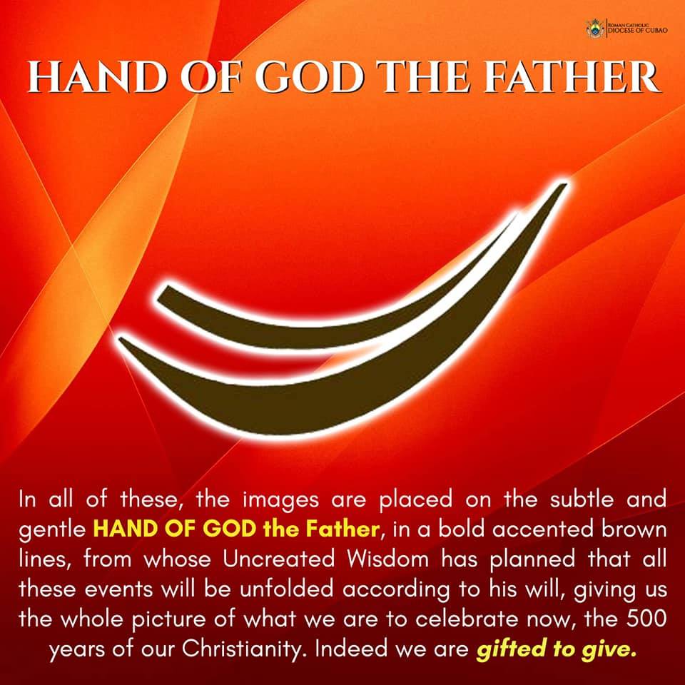
In all of these, the images are placed on the subtle and gentle HAND OF GOD the Father, in a bold accented brown lines, from whose Uncreated Wisdom has planned that all these events will be unfolded according to his will, giving us the whole picture of what we are to celebrate now, the 500 years of our Christianity. Indeed we are gifted to give.
LOGO ARTIST: Edilberto B. Dionio, DWST II-Theology Student


